
Titan Motorsports
Titan Motorsports
2026
Logo Design, Brand Identity
Client
Year
Services
Texan Racing Team
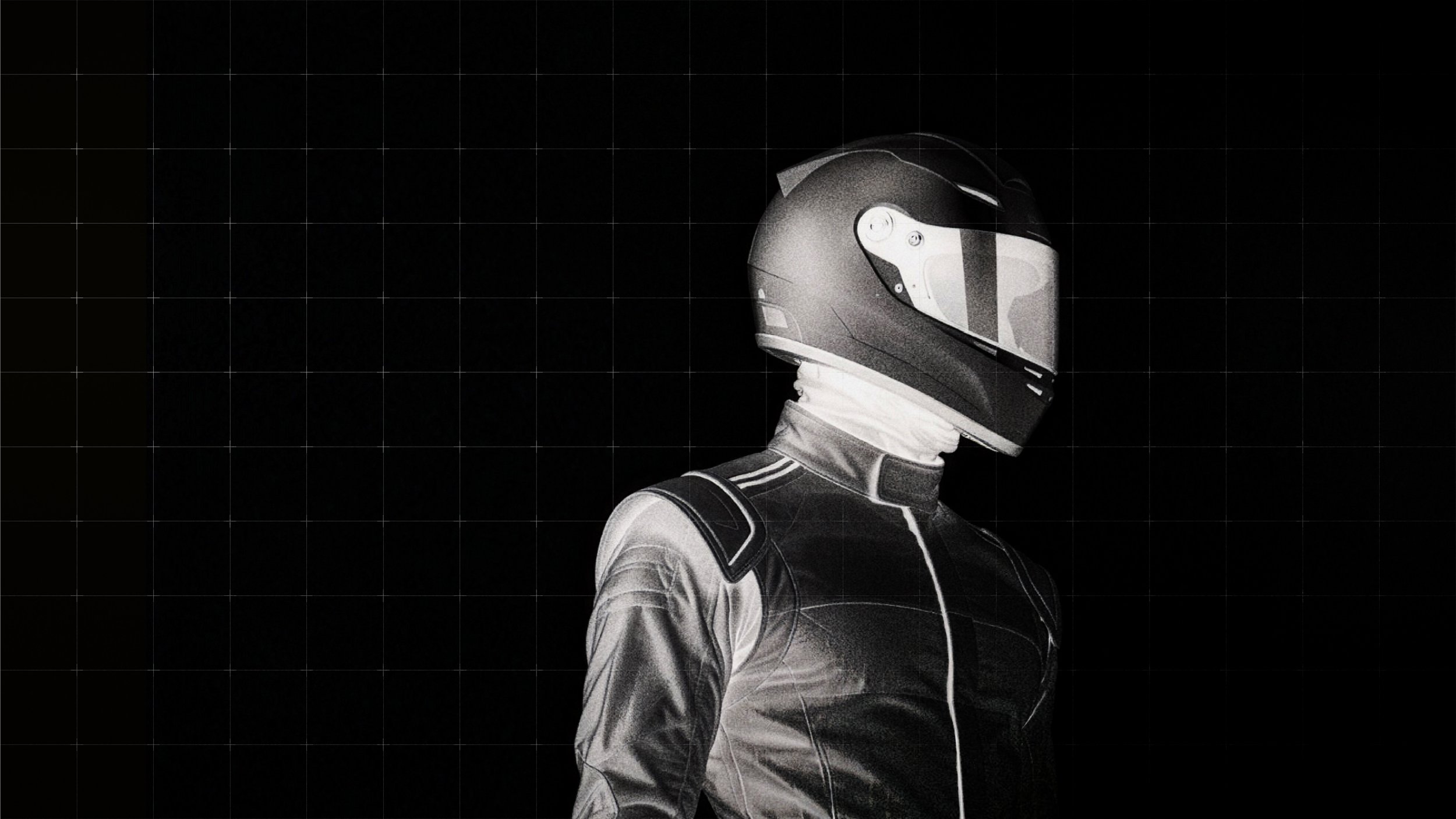
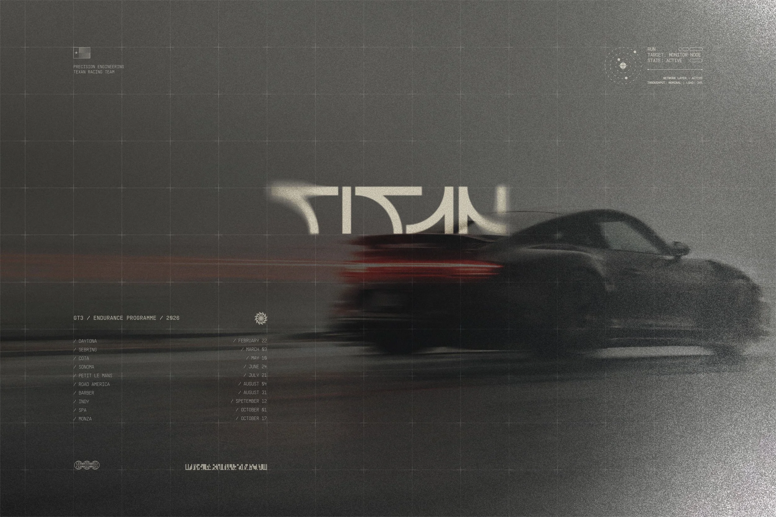
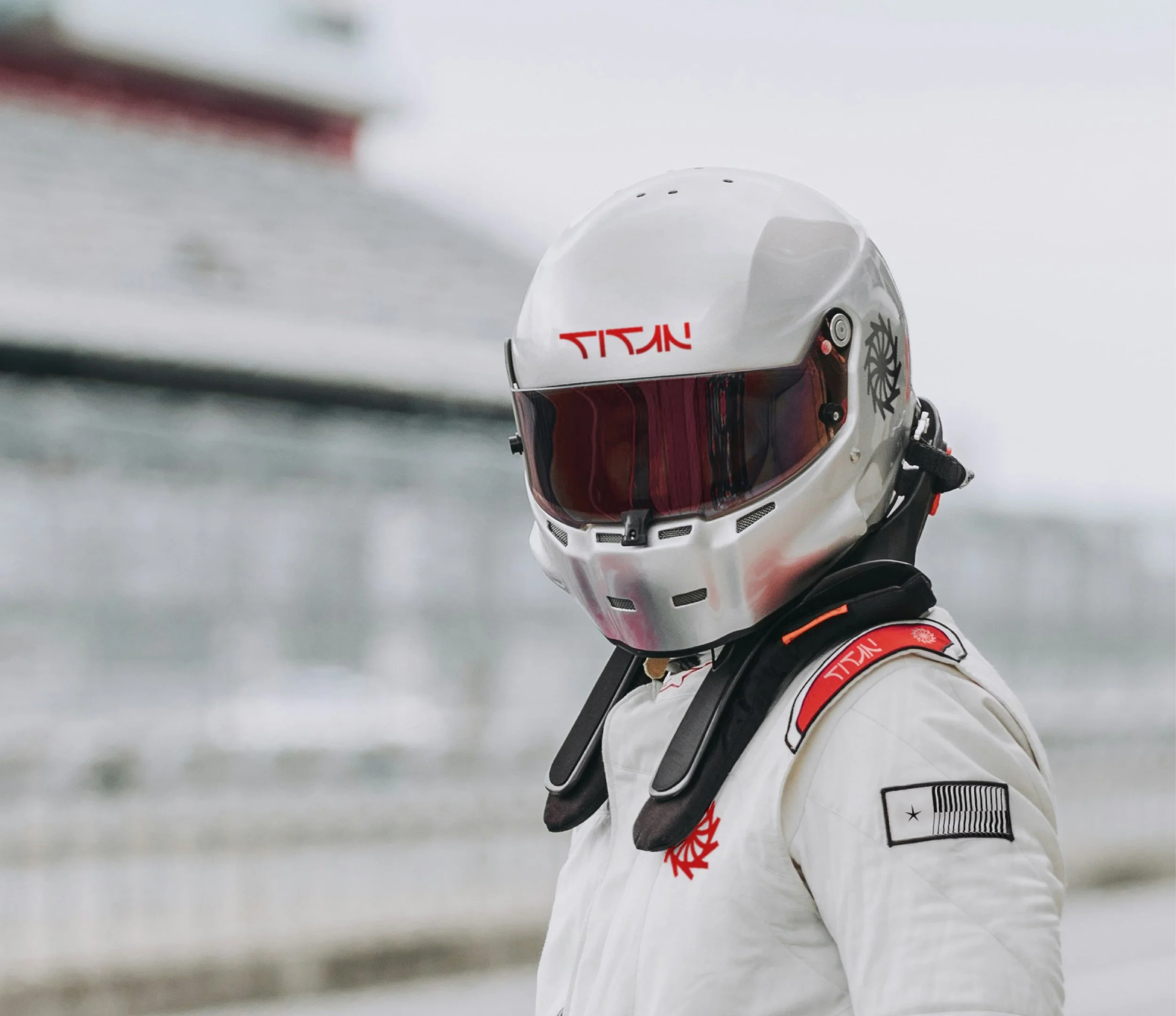
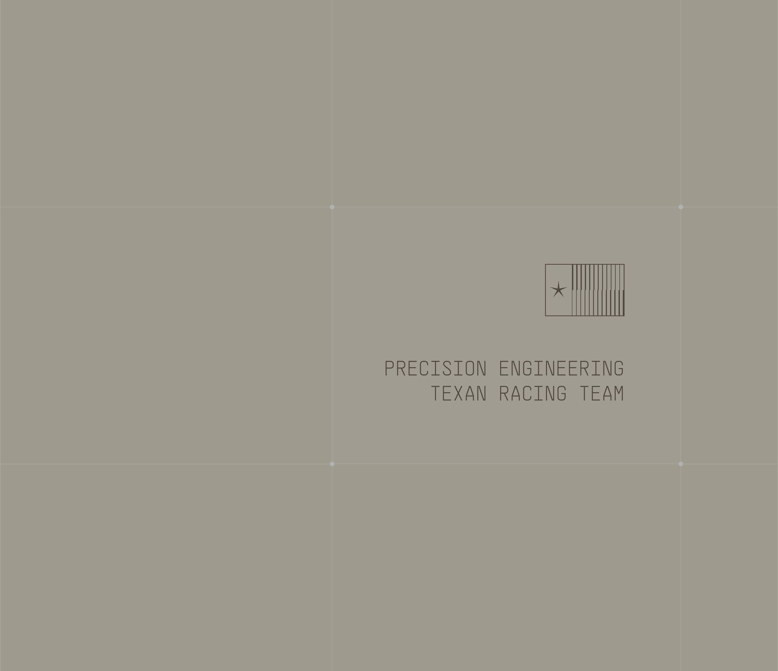
Titan Motorsport is an independent racing team, based in Texas USA competing in international GT and endurance racing. The brief was to develop a distinctive identity rooted in engineering discipline, precision and performance, with a visual language that felt as considered as the machinery behind it.
The brief
To develop a distinctive visual identity that reflects Titan’s engineering-led approach to motorsport. The brand needed to communicate strength, precision and technical sophistication, moving beyond the aggressive visual language often associated with racing.
The solution
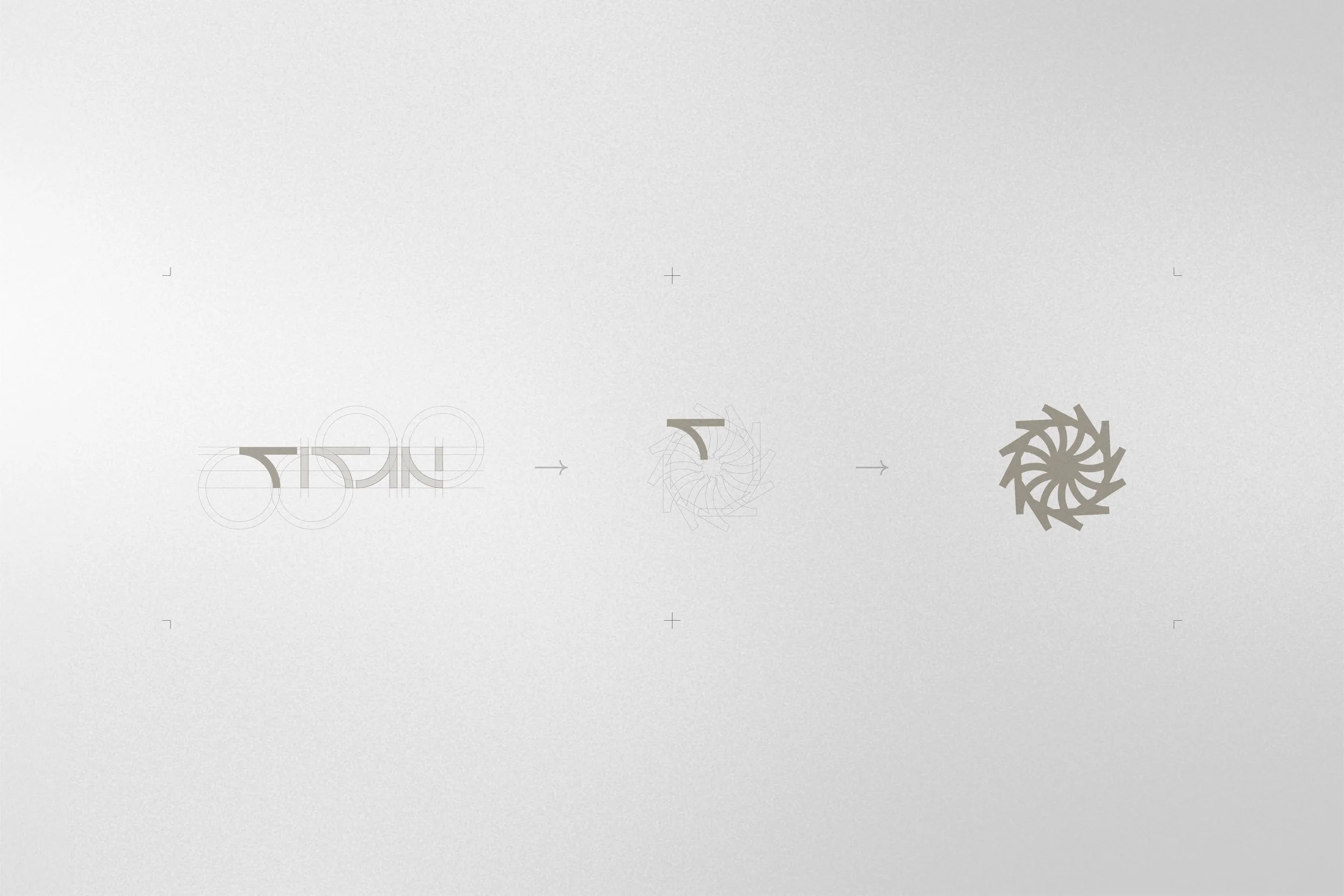
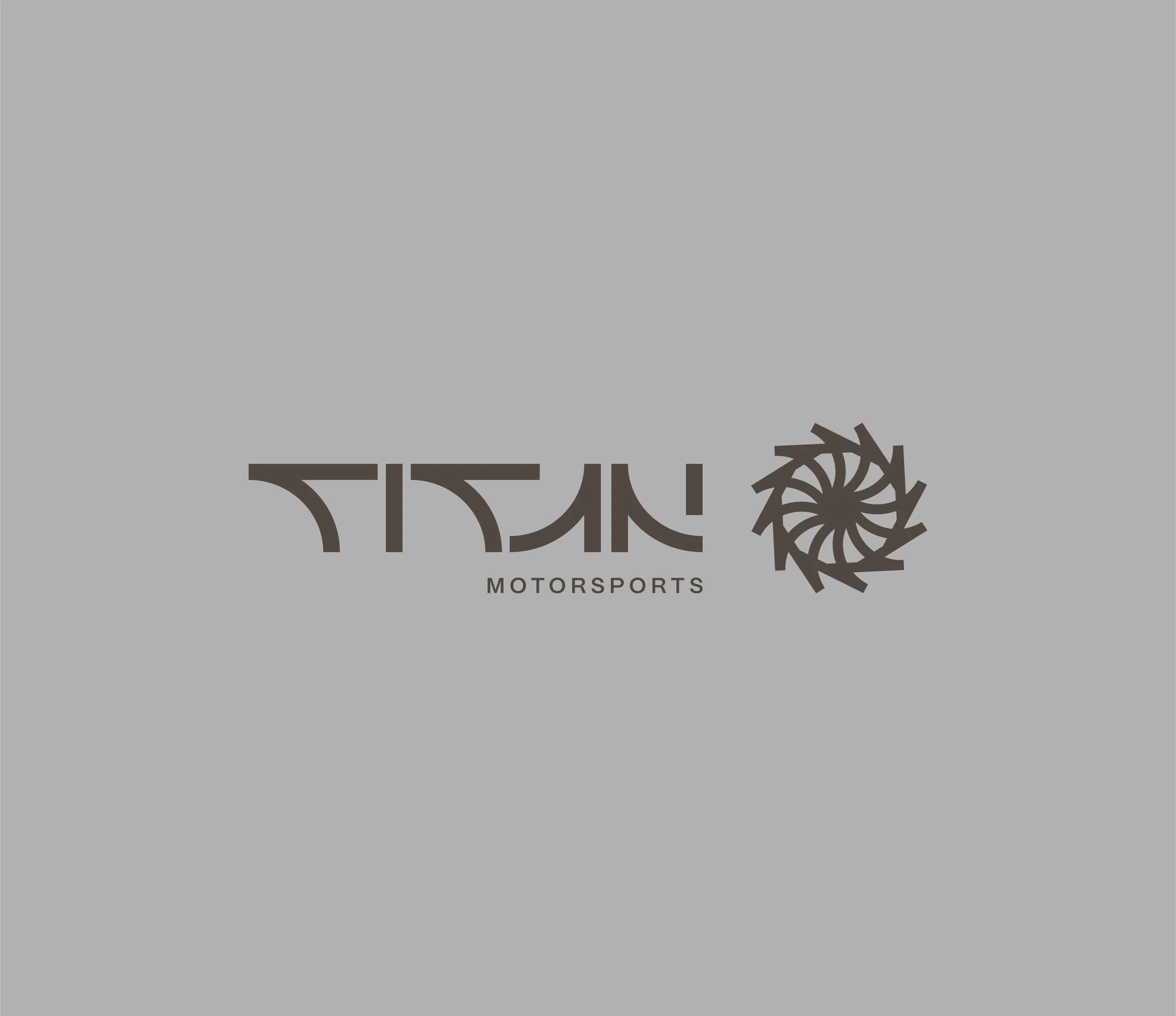
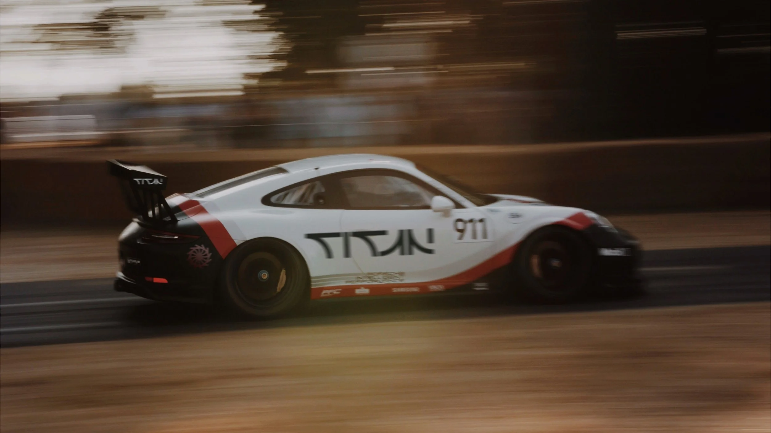
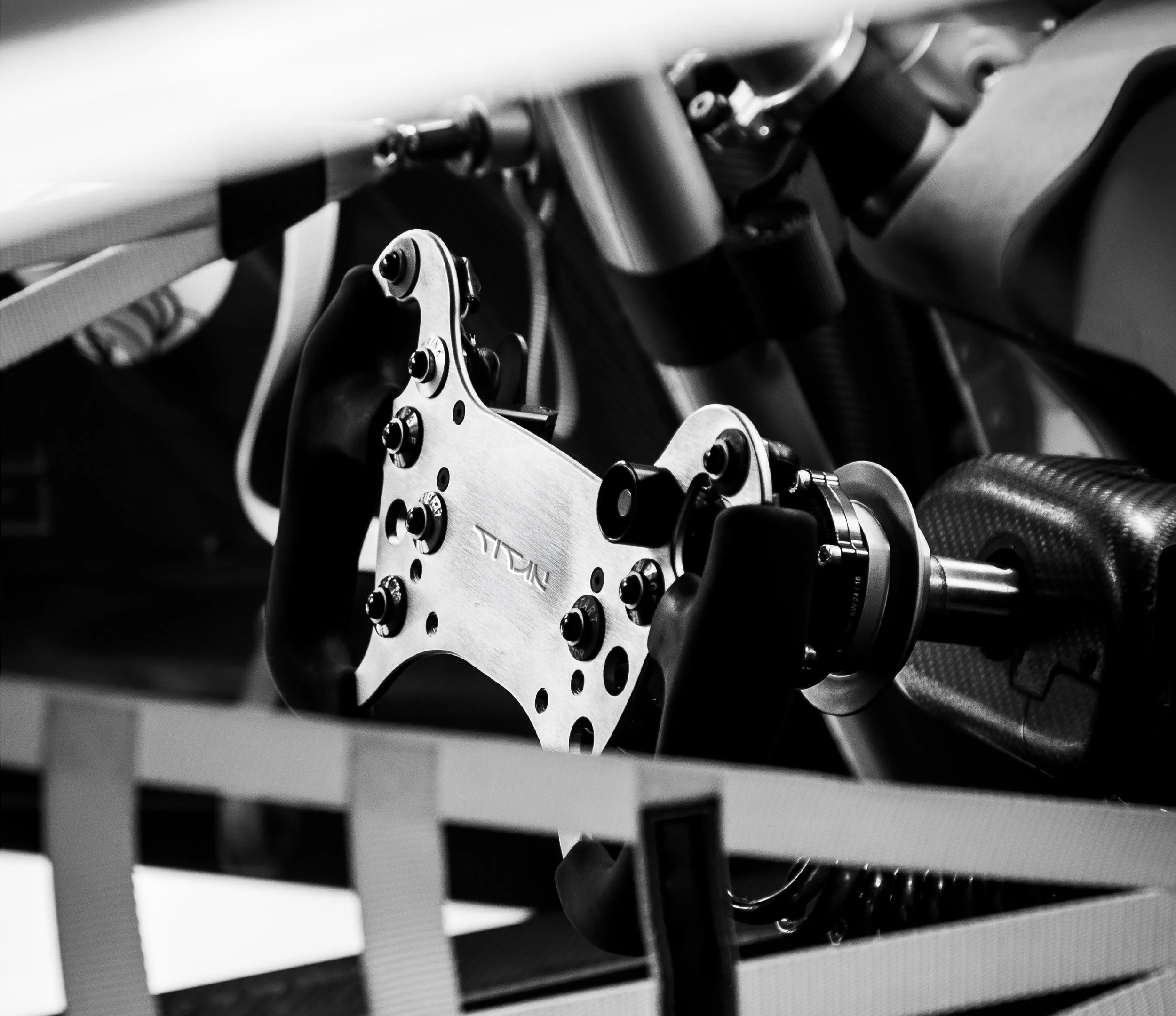
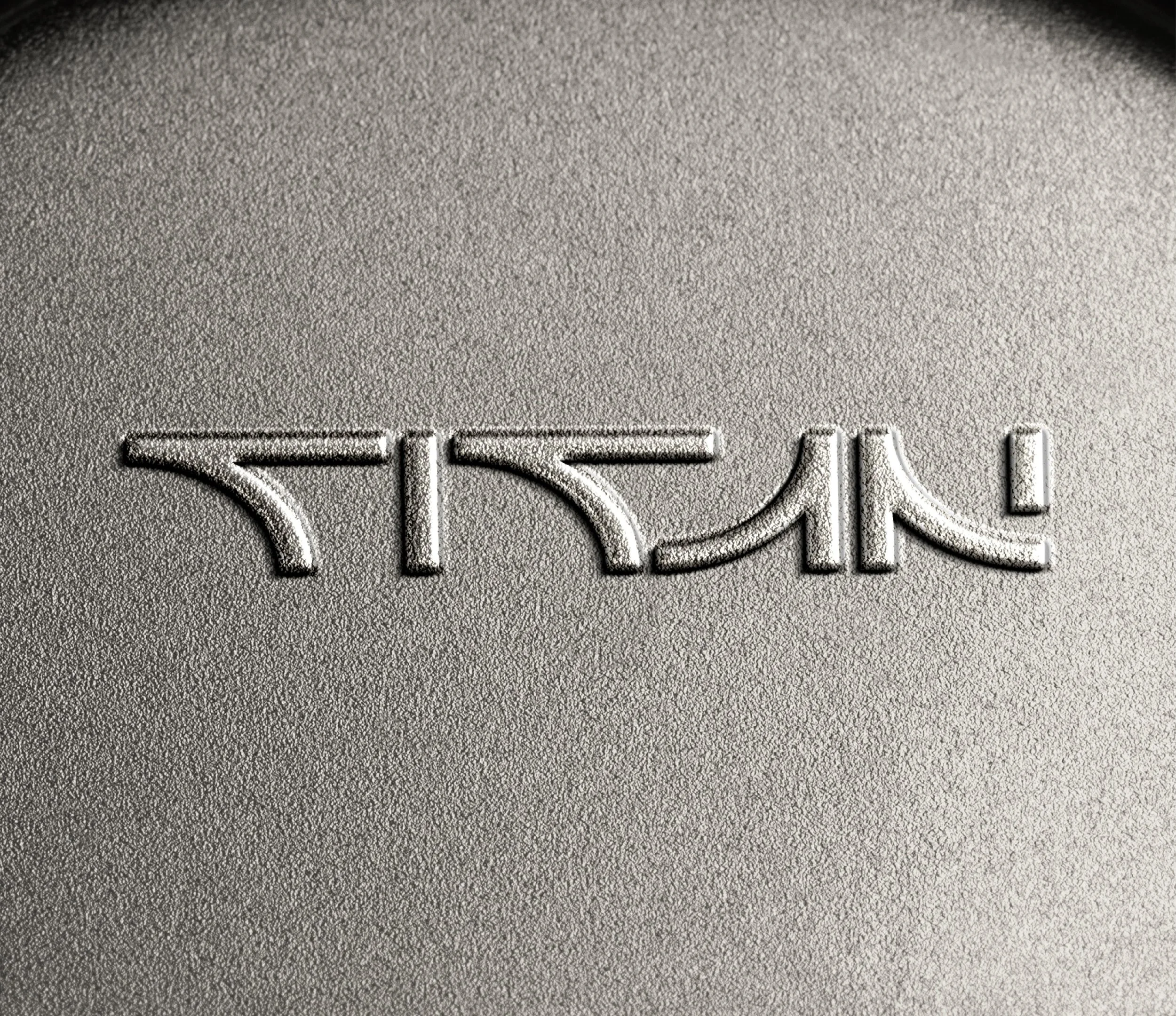
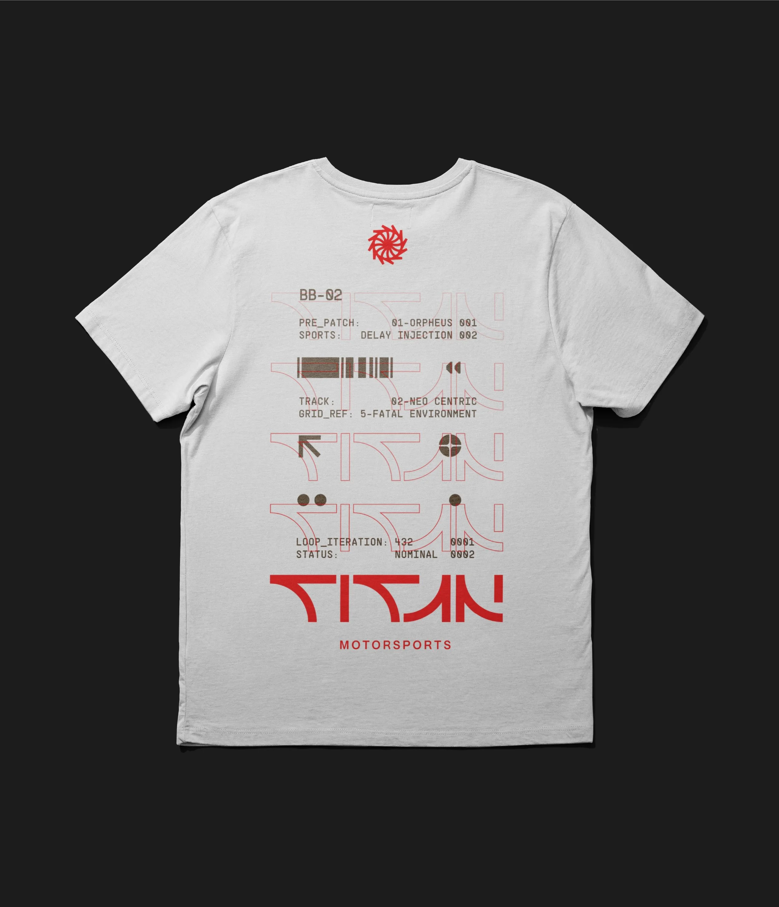
A simplified wordmark built from just two shapes, removing anything unnecessary to create a mark that feels strong, lightweight and engineered. It reflects Titan’s approach of extracting more performance from less.
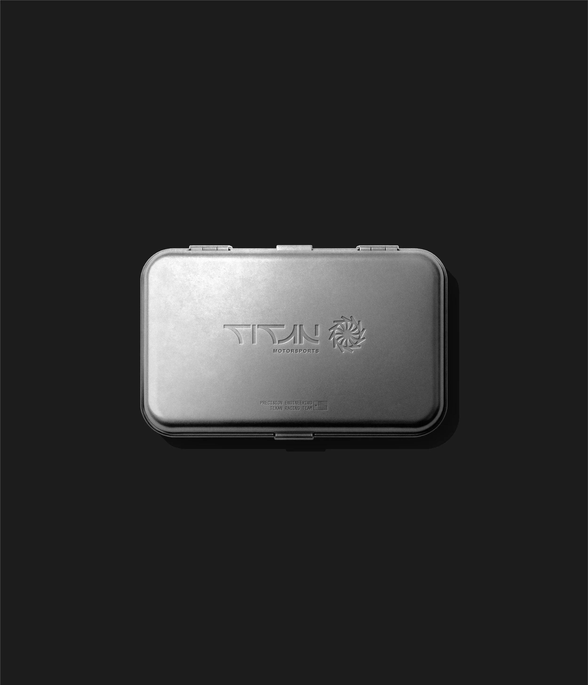
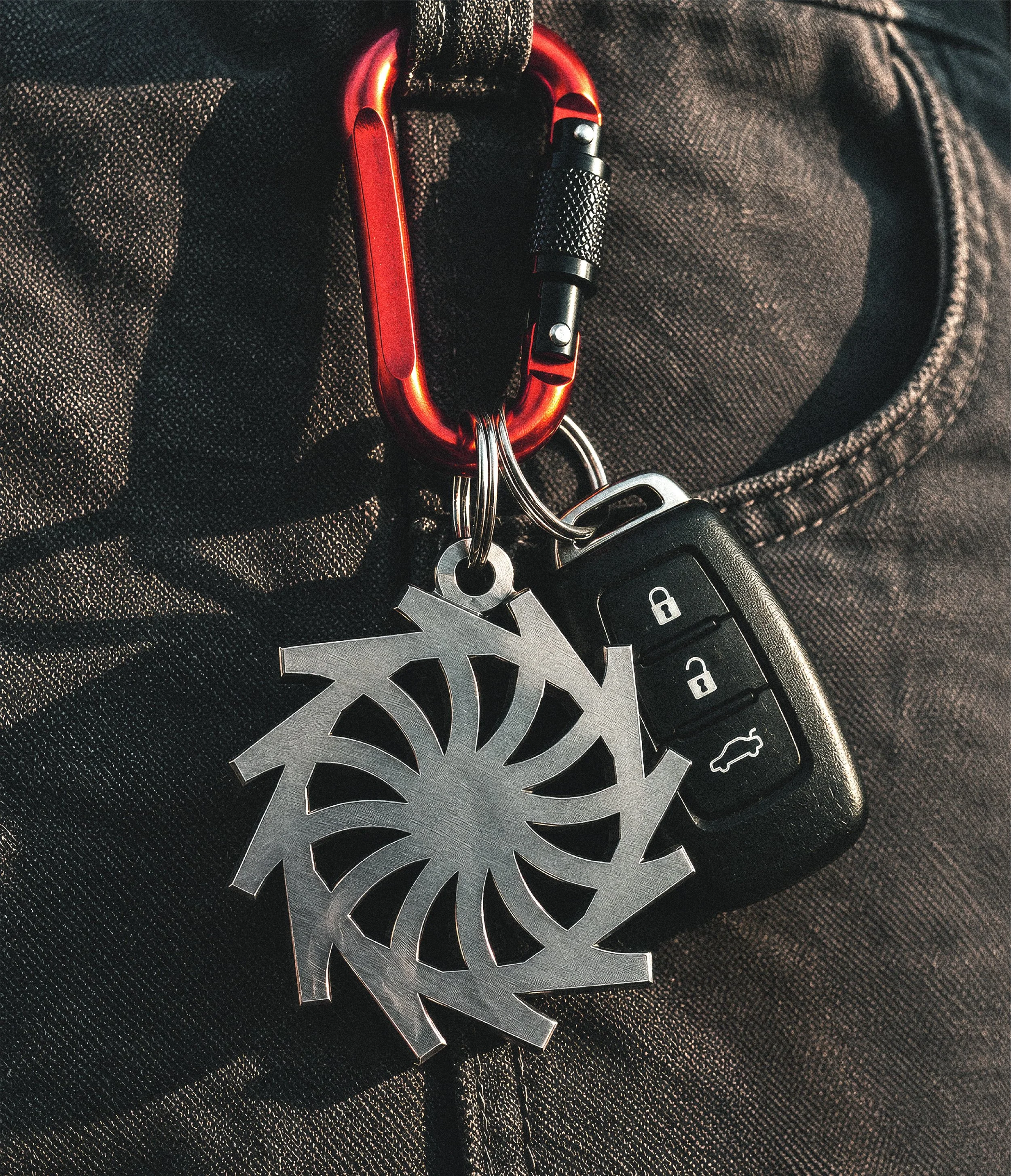
The T is repeated and rotated to create a form inspired by a differential cog, bringing a mechanical quality to the mark. The interlocking forms reference the precision engineering and finely tuned components that work together to deliver performance.
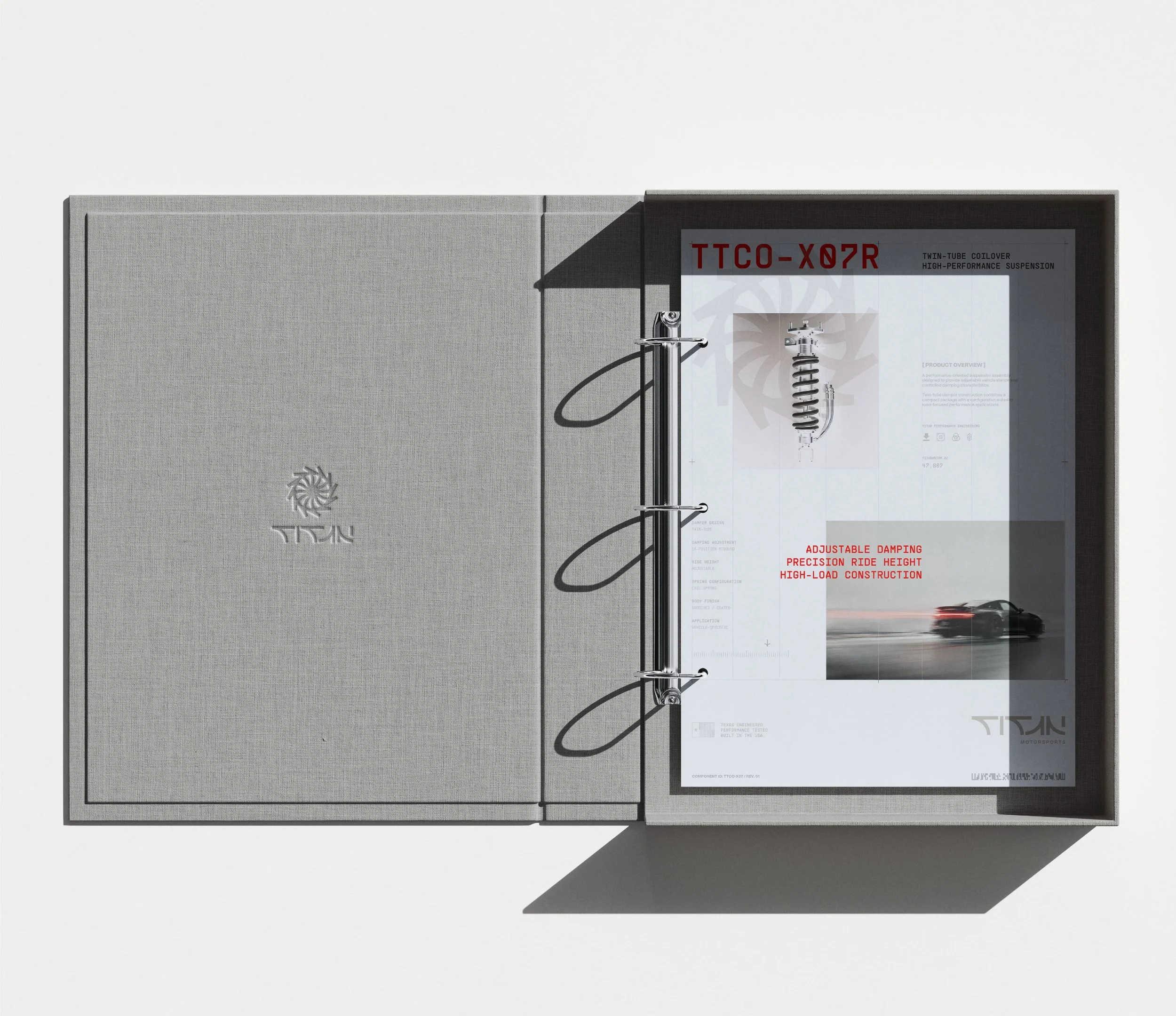
This thinking extends across the wider identity, with a restrained visual language that balances technical detail with a refined, contemporary aesthetic.
Outcome
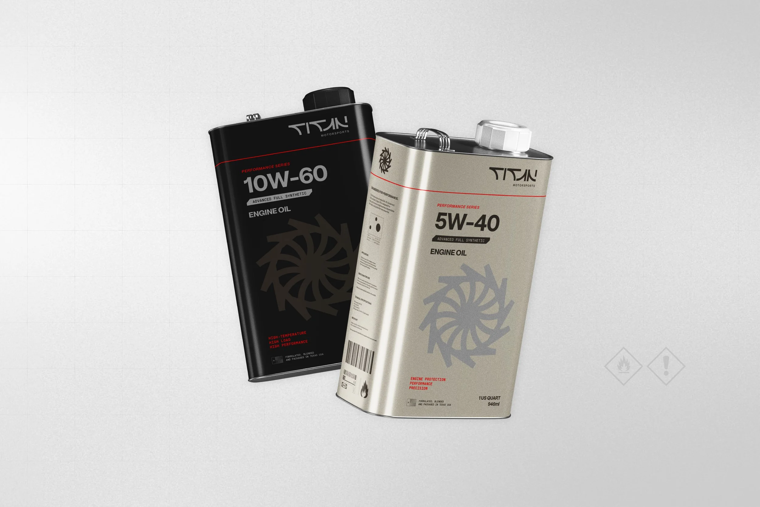
A cohesive motorsport identity built around precision, efficiency and performance. Designed to work across everything from team apparel and technical documentation to product packaging and race-day applications, the system gives Titan Motorsport a distinctive presence grounded in engineering rather than excess.